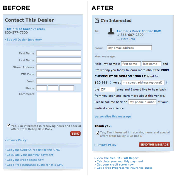
A few years ago, a new style of form hit the streets that emulated Mad Libs. Instead of stacking input fields like boxes on top of one another, the Mad Libs form provided sentences and invited users to fill in the blanks. Many folks found this new setup more friendly and engaging, which led to higher conversion rates.
Vast.com, an automobile and real estate listing website, tested this type of form on their site and experienced an increased conversion rate of 25-40% across the board. Here’s a shot of Vast.com’s Contact Dealer form, before and after they implemented the Mad Libs style.

Validation
If you want to prevent spam and bad user information, you need to validate your forms. Fortunately, you have a number of options at your disposal. WordPress offers several plugins to prevent spam, including Akismet (which filters out comment and track-back spam) and Gravity Forms (a form-building plugin with built-in validation and conditional logic).
For non-CMS websites, there are other options such as jQuery validation scripts or PHP validation. There’s also the honey pot technique, which is my personal favorite. It uses a form field that’s invisible to users, but visible to bots. This field can be checked with JavaScript upon submission, and rejected if the hidden field has been filled in.
CAPTCHA is a form of validation that’s intended to distinguish human beings from bots and other automated processes. Basically, the user is required to type in a string of letters and/or numbers before being allowed to continue. CAPTCHA was one of the earlier forms of validation and is still in wide use. However, you should really only use it as a last resort because it has a tendency to decrease lead conversions.
We have covered the layout of the form and the validation of the input. Now let’s get a little technical and talk about forms and mobile devices.
Mobile Friendly and HTML5
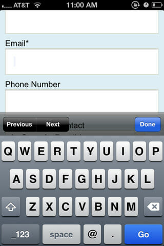
When HTML5 emerged, it brought with it a number of pretty incredible conveniences, such as input types. Filling out a form on your phone can be a traumatic and frustrating experience, or it can be a breeze. Using the iPhone as an example, you can see that there are different keyboards for different functions.


<input type="text" name="name" value="John" />Looking at the examples above, see the differences between the keyboards when the cursor is placed in each type of input field. Name and Email use a text keyboard and Telephone uses the numeric keyboard:
<input type="email" name="email" value="[email protected]" />
<input type="tel" name="telephone" value="555-111-2345" />
There are many new HTML5 input types that can be used on mobile devices and modern desktop browsers. A full list of HTML5 input types can be found at the W3C website.
Forms don’t need to be a mystery, and with the correct information and implementation they can increase lead conversions and grow your business. Easy-to-use forms make for happy customers.


